

Museum of Ancient Wonders Brand Identity Expansion
This is a small museum that opened in 2020 with its focus to offer ancient artifacts and artwork in an area popularly showcasing mid-century modernism. What is unique about the Museum of Ancient Wonders is that it exhibits artifacts in a broad scope from the first form of life to the present day, a timeline of life.
This is an interpretation project of the museum of creating its own brand identity while also respecting what has already been created which is the logo and the colors associated with it.
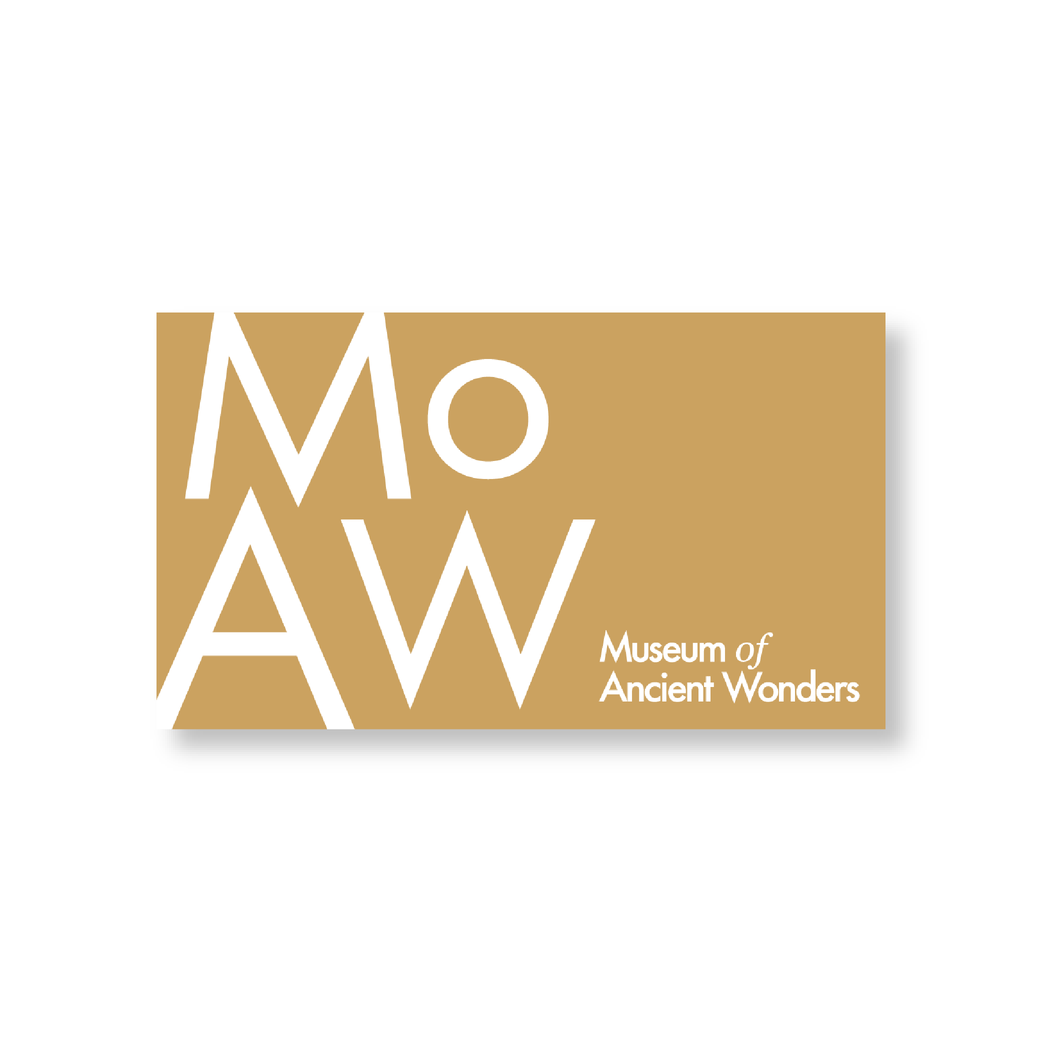
Logos


Colors
Primary Colors
The first three colors were already existing so I wanted to respect the origin of these colors and the current identity already has. I added an additional color to break the white and black pair.
From left to right: Gold, Celestial White, Obsidian
Secondary Colors
These colors are based on some of the elements and textures humanity has interacted with that built civilizations and expanded knowledge.
From left to right: Sand, Water, Fire, Ash
Typefaces
The typefaces in the original logo are Futura and Georgia. The logo has a long tagline and to maintain the simplicity of the logo, I opted to remove it. Yet, considering Georgia is a sans-serif typeface, I wanted to use a typeface that shows the antiquities the museum is exhibiting.
I chose to continue using Futura and switched from Georgia to Garamond.

Materials
Letterhead | Envelopes | Business Cards


Posters


Visitor Guide
The concept of this is a large piece of paper to be folded in half twice.
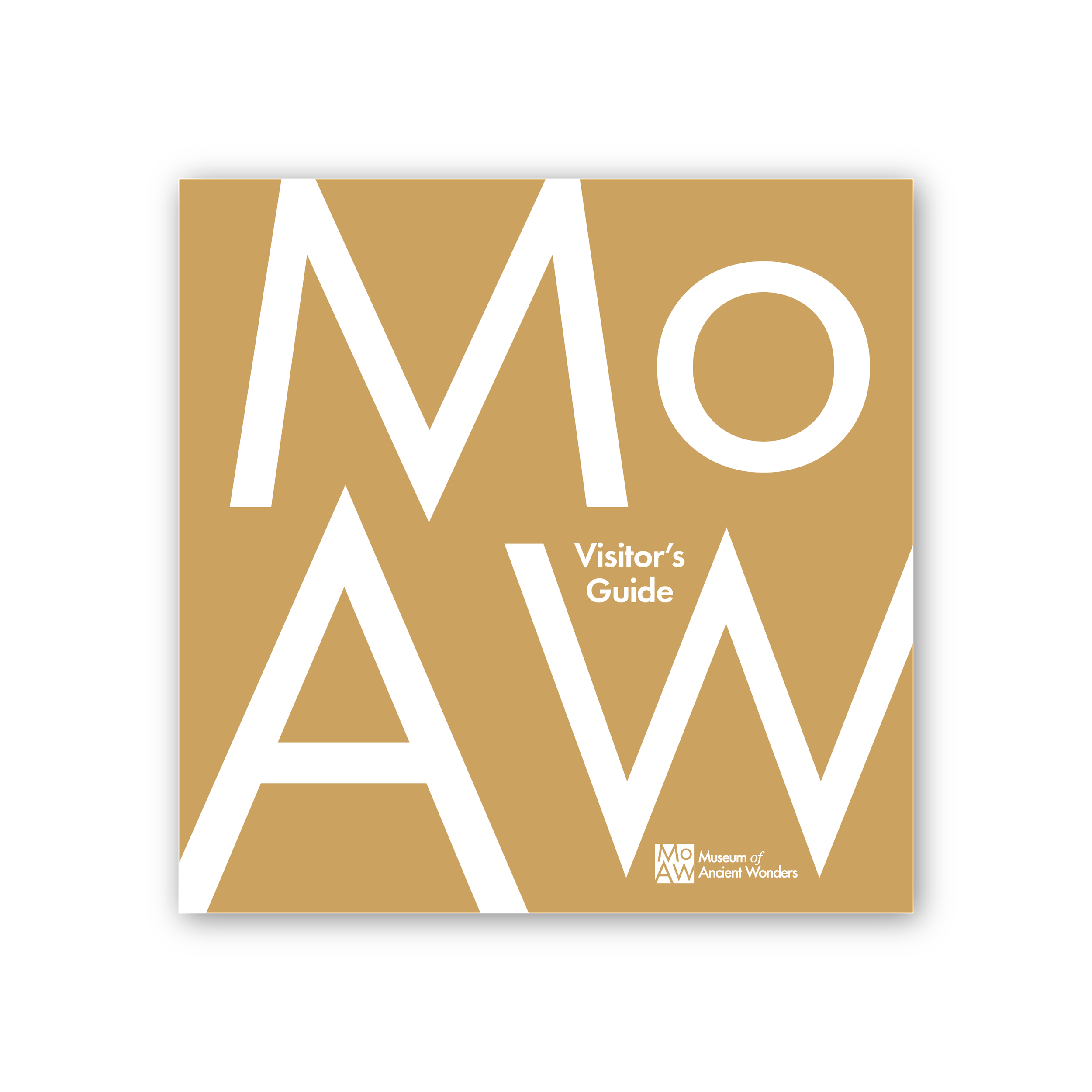
Front Cover

Second and Third Page
One can unfold the guide again and the map will appear.


Back Cover
